来自:Python大数据分析 费弗里
1 简介
matplotlib作为数据可视化的强力工具,可以帮助我们自由创作各式各样的数据可视化作品,其中matplotlib.pyplot.table模块就专门用于绘制「表格」,但是由于参数复杂,且默认样式单一简陋,想基于它绘制出美观的表格需要花费不少功夫。
而我最近发现的一个基于matplotlib的第三方库plottable,用它来生成数据表格图既简单又美观
 2 基于plottable绘制漂亮的表格
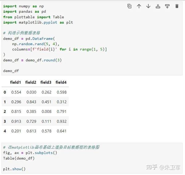
使用pip install plottable完成安装后,我们先从一个简单的例子了解其基础的使用方式:
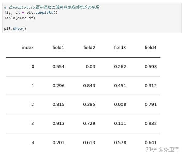
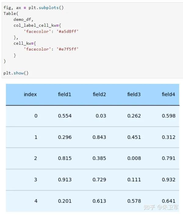
2.1 从简单例子出发plottable的基础使用很简单,在已有数据框的基础上,直接调用plottable中的Table模块即可:
渲染出的表格图如下:
 2.2 plottable的常用方法
了解到plottable的基础用法后,接下来我们来学习如何添加一些常用参数来对表格进行美化:
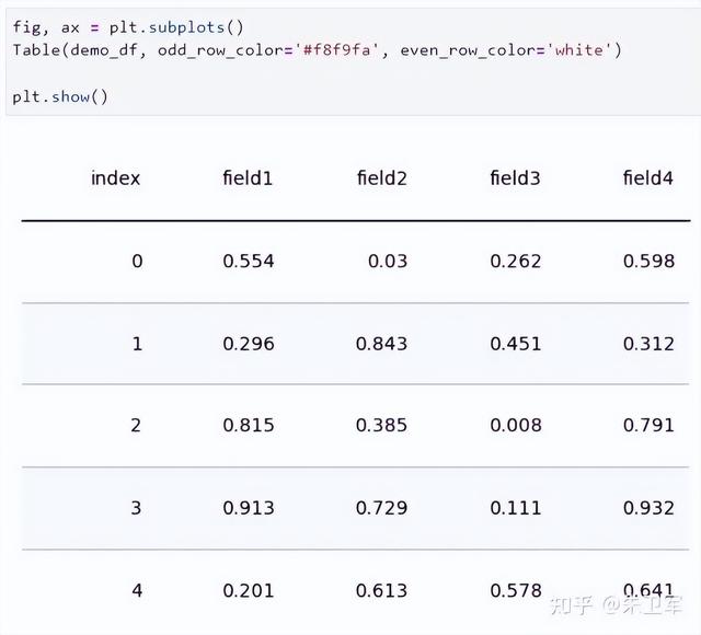
2.2.1 控制表格奇数偶数行底色通过在Table()中设置参数odd_row_color和even_row_color,我们可以传入matplotlib中合法的色彩值进行表格奇数偶数行底色的设置:
 2.2.2 控制表头单元格与数据单元格样式
通过Table()中的参数col_label_cell_kw、cell_kw,我们可以分别对表头区域单元格、数据区域单元格进行样式设置,接受matplotlib.patches.Rectangle全部可用参数,例如:
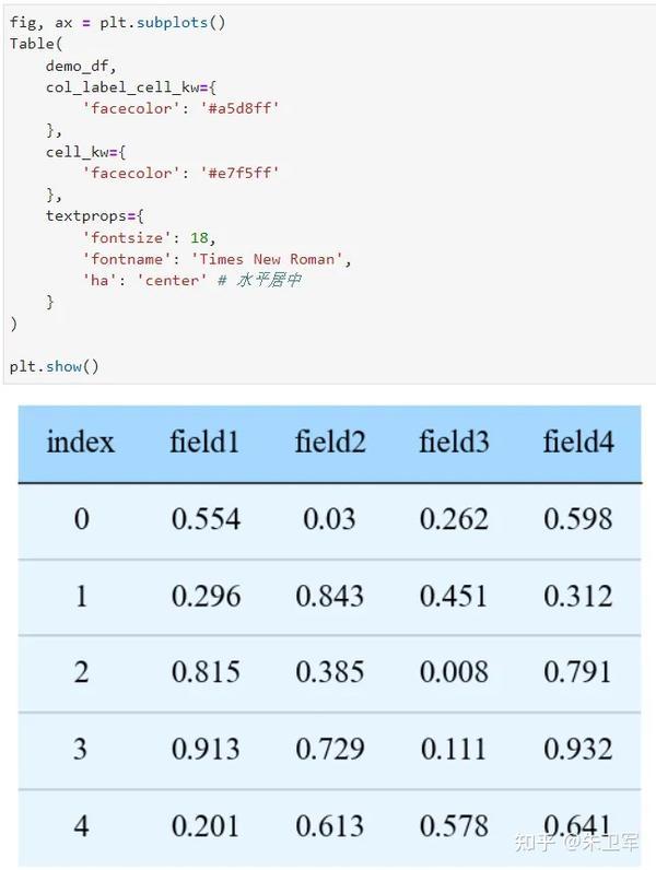
 2.2.3 调节单元格文字样式
通过参数textprops我们可以对全部单元格的文字样式进行控制:
 2.2.4 配置行分割线
通过bool型参数col_label_divider、footer_divider、row_dividers可以分别设置是否为表头、表格尾部、数据行绘制分割线:

而通过参数col_label_divider_kw、footer_divider_kw、row_divider_kw则可以分别控制各个部分分割线的样式,支持plt.plot中全部参数:
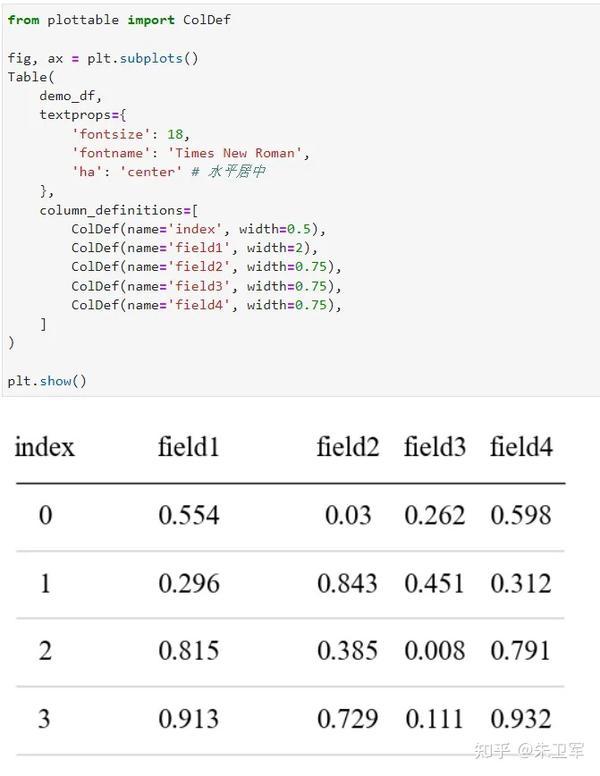
 2.2.5 基于ColDef的列样式细粒度设置
plottable中最强大的地方在于,其通过配置由plottable.ColDef对象列表构成的column_definitions参数,可细粒度地对每一列进行自由的样式定义,其中每个ColDef()对象通过参数name与列名进行对应,常见的用法有:
分别设置不同字段的宽度比例系数以每列的默认宽度为1,可以分别为不同列调整宽度:
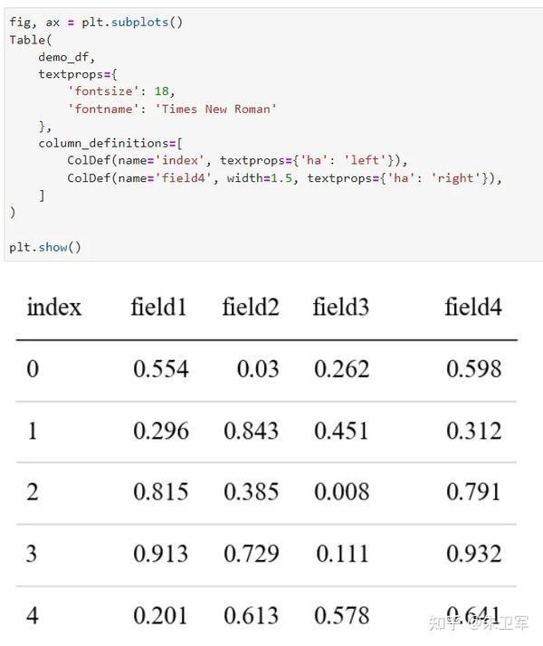
 分别设置不同字段的文本对齐方式
每个ColDef对象都可设置textprops参数,基于此可以实现为不同字段定义水平对齐方式:
 分别为不同字段设置数值色彩映射
通过为ColDef设置参数cmap、text_cmap,我们可以分别基于对应列的数值,对其单元格底色或字体颜色进行值映射:
 为字段创建分组展示
通过为若干个ColDef设置相同的group参数,我们可以为具有相同group参数的字段添加分组标识:
 为指定字段绘制列边框
通过为ColDef设置参数border,我们可以决定如何绘制不同字段的列边框:

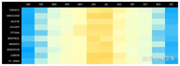
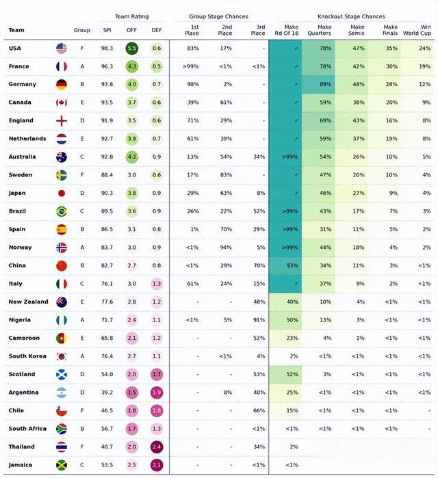
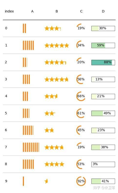
除了本文所述的部分功能外,plottable还有很多高级进阶的使用方法,譬如单元格图片渲染、自定义单元格绘制内容等,下面的几个例子就是基于plottable创作的:
❝https://plottable.readthedocs.io/en/latest/example_notebooks/wwc_example.html❞
❝https://plottable.readthedocs.io/en/latest/example_notebooks/bohndesliga_table.html❞

❝https://plottable.readthedocs.io/en/latest/example_notebooks/plot_example.html❞
❝https://plottable.readthedocs.io/en/latest/example_notebooks/heatmap.html❞