
大家好,今天为大家分享一个超酷的 Python 库 - bqplot。
Github地址:https://github.com/bqplot/bqplot
在数据科学和机器学习领域,数据可视化是理解和分析数据的重要工具。bqplot 是一个基于 Jupyter Notebook 的 Python 可视化库,专注于交互式数据可视化。它结合了 D3.js 的强大功能和 Python 的易用性,使用户能够在 Jupyter 环境中创建丰富的交互式图表。bqplot 的设计理念是将每个可视化元素映射为对应的 Python 对象,从而提供高度的可定制性和交互性。本文将详细介绍 bqplot 库,包括其安装方法、主要特性、基本和高级功能,以及实际应用场景,帮助全面了解并掌握该库的使用。
安装要使用 bqplot 库,首先需要安装它。
使用 pip 安装
可以通过 pip 直接安装 bqplot:
pip install bqplot使用 conda 安装
如果使用 Anaconda,可以通过以下命令安装 bqplot:
conda install -c conda-forge bqplot安装 Jupyter Notebook 扩展
bqplot 依赖于 Jupyter Notebook 扩展,确保已经安装并启用了这些扩展:
jupyter nbextension enable --py --sys-prefix bqplotjupyter nbextension enable --py --sys-prefix widgetsnbextension特性交互性:支持与图表的实时交互,如缩放、平移和悬停提示。丰富的图表类型:包括折线图、柱状图、散点图、热力图等。与 Jupyter 深度集成:直接在 Jupyter Notebook 和 JupyterLab 中使用,方便数据分析和展示。高度可定制化:通过 Python 对象映射,可以自定义图表的各个元素。支持动画:可以为图表添加动态效果,提升可视化的表现力。基本功能创建简单的折线图
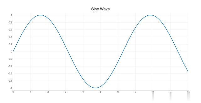
可以使用 bqplot 快速创建一个简单的折线图:
import bqplot as bqimport numpy as npfrom bqplot import pyplot as plt# 数据生成x = np.linspace(0, 10, 100)y = np.sin(x)# 创建折线图plt.figure(title="Sine Wave")plt.plot(x, y)plt.show()输出结果:
创建柱状图
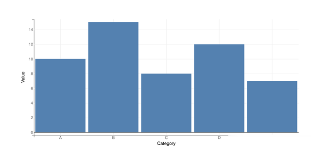
bqplot 也支持创建柱状图:
import bqplot as bq# 数据x_data = ['A', 'B', 'C', 'D', 'E']y_data = [10, 15, 8, 12, 7]# 创建刻度和轴x_scale = bq.OrdinalScale()y_scale = bq.LinearScale()# 创建柱状图bars = bq.Bars(x=x_data, y=y_data, scales={'x': x_scale, 'y': y_scale})# 创建图表ax_x = bq.Axis(scale=x_scale, label='Category')ax_y = bq.Axis(scale=y_scale, label='Value', orientation='vertical')# 展示图表fig = bq.Figure(marks=[bars], axes=[ax_x, ax_y])fig输出结果:
创建散点图
可以使用 bqplot 创建一个简单的散点图:
import bqplot as bqimport numpy as np# 数据生成x = np.random.rand(100)y = np.random.rand(100)# 创建刻度和轴x_scale = bq.LinearScale()y_scale = bq.LinearScale()# 创建散点图scatters = bq.Scatter(x=x, y=y, scales={'x': x_scale, 'y': y_scale}, colors=['red'])# 创建图表ax_x = bq.Axis(scale=x_scale, label='X-axis')ax_y = bq.Axis(scale=y_scale, label='Y-axis', orientation='vertical')# 展示图表fig = bq.Figure(marks=[scatters], axes=[ax_x, ax_y])fig输出结果:
 高级功能
高级功能交互功能
bqplot 支持丰富的交互功能,如鼠标悬停、点击事件等。以下示例展示了如何添加鼠标悬停事件来显示数据点的值:
import bqplot as bqimport numpy as np# 数据生成x = np.linspace(0, 10, 100)y = np.sin(x)# 创建刻度和轴x_scale = bq.LinearScale()y_scale = bq.LinearScale()# 创建折线图line = bq.Lines(x=x, y=y, scales={'x': x_scale, 'y': y_scale})# 定义鼠标悬停事件def on_hover(change): index = change['data']['index'] print(f"Hovered over point: x={x[index]}, y={y[index]}")# 绑定事件line.on_hover(on_hover)# 创建图表ax_x = bq.Axis(scale=x_scale, label='X-axis')ax_y = bq.Axis(scale=y_scale, label='Y-axis', orientation='vertical')# 展示图表fig = bq.Figure(marks=[line], axes=[ax_x, ax_y])fig输出结果:

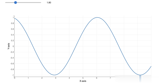
动态更新图表
bqplot 支持动态更新图表内容,以下示例展示了如何实时更新折线图数据:
import bqplot as bqimport numpy as npimport ipywidgets as widgets# 数据生成x = np.linspace(0, 10, 100)y = np.sin(x)# 创建刻度和轴x_scale = bq.LinearScale()y_scale = bq.LinearScale()# 创建折线图line = bq.Lines(x=x, y=y, scales={'x': x_scale, 'y': y_scale})# 创建图表ax_x = bq.Axis(scale=x_scale, label='X-axis')ax_y = bq.Axis(scale=y_scale, label='Y-axis', orientation='vertical')fig = bq.Figure(marks=[line], axes=[ax_x, ax_y])# 创建滑动条更新数据slider = widgets.FloatSlider(value=0, min=0, max=2 * np.pi, step=0.1)def update_wave(change): line.y = np.sin(x + slider.value)slider.observe(update_wave, names='value')widgets.VBox([slider, fig])输出结果:
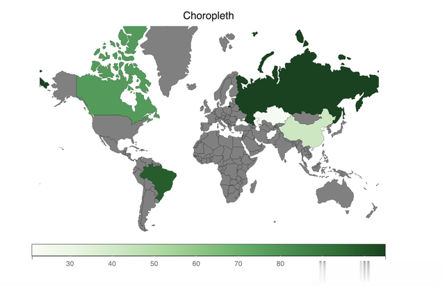
使用地图可视化
import bqplot.pyplot as pltfig = plt.figure(title="Choropleth")plt.scales(scales={"color": bq.ColorScale(scheme="Greens")})chloro_map = plt.geo( map_data="WorldMap", color={643: 105, 4: 21, 398: 23, 156: 42, 124: 78, 76: 98}, colors={"default_color": "Grey"},)fig输出结果:
 实际应用场景
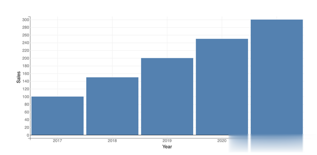
数据分析报告
在数据分析报告中使用 bqplot 创建交互式图表,帮助用户更直观地理解数据。
import bqplot as bqimport pandas as pd# 数据生成data = pd.DataFrame({ 'Year': [2017, 2018, 2019, 2020, 2021], 'Sales': [100, 150, 200, 250, 300]})# 创建刻度和轴x_scale = bq.OrdinalScale()y_scale = bq.LinearScale()# 创建柱状图bars = bq.Bars(x=data['Year'], y=data['Sales'], scales={'x': x_scale, 'y': y_scale})# 创建图表ax_x = bq.Axis(scale=x_scale, label='Year')ax_y = bq.Axis(scale=y_scale, label='Sales', orientation='vertical')# 展示图表fig = bq.Figure(marks=[bars], axes=[ax_x, ax_y])fig输出结果:
实时数据监控
使用 bqplot 监控实时数据,例如股票价格或传感器读数,及时捕捉数据变化。
import bqplot as bqimport numpy as npimport ipywidgets as widgetsimport time# 初始化数据x = np.arange(0, 10, 0.1)y = np.sin(x)# 创建刻度和轴x_scale = bq.LinearScale()y_scale = bq.LinearScale()# 创建折线图line = bq.Lines(x=x, y=y, scales={'x': x_scale, 'y': y_scale})# 创建图表ax_x = bq.Axis(scale=x_scale, label='Time')ax_y = bq.Axis(scale=y_scale, label='Value', orientation='vertical')fig = bq.Figure(marks=[line], axes=[ax_x, ax_y])# 实时更新数据def update_plot(change): new_y = np.sin(x + change['new']) line.y = new_y# 创建滑动条模拟时间进程slider = widgets.FloatSlider(value=0, min=0, max=10, step=0.1)slider.observe(update_plot, names='value')widgets.VBox([slider, fig])输出结果:

数据科学教育
在数据科学课程中,使用 bqplot 创建互动可视化,帮助学生更好地理解数据分析和机器学习算法。
import bqplot as bqimport numpy as np# 数据生成x = np.linspace(0, 10, 100)y = np.sin(x)# 创建刻度和轴x_scale = bq.LinearScale()y_scale = bq.LinearScale()# 创建折线图line = bq.Lines(x=x, y=y, scales={'x': x_scale, 'y': y_scale})# 创建图表ax_x = bq.Axis(scale=x_scale, label='X-axis')ax_y = bq.Axis(scale=y_scale, label='Y-axis', orientation='vertical')# 展示图表fig = bq.Figure(marks=[line], axes=[ax_x, ax_y])fig输出结果:
 总结
总结bqplot 是一个功能强大且易于使用的 Python 可视化库,能够在各种应用场景中高效地创建交互式图表。通过支持丰富的图表类型、灵活的交互功能以及与 Jupyter 深度集成,bqplot 提供了强大的功能和灵活的扩展能力。本文详细介绍了 bqplot 库的安装方法、主要特性、基本和高级功能,以及实际应用场景。希望本文能帮助大家全面掌握 bqplot 库的使用,并在实际项目中发挥其优势。无论是在数据分析、实时监控还是教育教学中,bqplot 都将是一个得力的工具。