况物制是一个秉承创意理念的咖啡品牌,“况物制”谐音“矿物质”,通过语言的巧妙对峙,传递出轻松、随意的品牌精神。品牌的图形因“KUOWOO”六个字母之间的变化呈现出不规则的六边形,象征更多变化的可能性,也暗示着况物制强大的内核,诠释出充满生命力的品牌理念。
KUOWOO is a coffee brand that adheres to the concept of creativity. “KUOWOO” is homophonic to “mineral”, which conveys the relaxed and casual brand spirit through the clever confrontation of language. The brand’s graphics present an irregular hexagon due to the changes between the six letters of “KUOWOO”, symbolizing more possibilities of change, and also implying the strong core of Kuangwuzhi, interpreting the brand concept full of vitality.
▼店铺门头,storefront© 内外空间摄影赵龙


项目位于临街一层,位于佳和之宝BMW 4s店入口,结合门店所在环境,以车库场景作为概念,设想是一个供过路人稍作休息、补充能量的休憩站,在此维修调整,补充满满“况物制”再出发。原场地为相对方正的空间形态,我们利用脚手架重新构建项目的外立面,它是粗糙的,临时的,轻量化的。简单透光的阳光板,赋予整体轻盈的质感,通风且舒适,以一种略带临时感的姿态与周围形成有趣的对话,以此表现不被限制的生命力。
The project is located on the first floor of the street, at the entrance of the BMW 4s store. Considering the location of the store and the garage scene as the concept, it is envisaged to be a rest station for passers-by to take a rest and replenish energy, and repair and adjust here to replenish the “condition system” before starting. The original site had a relatively square spatial form, and we used scaffolding to reconstruct the facade of the project, which is rough, temporary and lightweight. The simple and transparent sunlight board gives the overall light texture, ventilation and comfort, and forms an interesting dialogue with the surrounding area in a slightly temporary gesture, so as to express the unrestricted vitality.
▼室内概览,interior overview© 内外空间摄影赵龙

空间整体围绕金属色与灰色调展开,营造出一种充满现代感和机能性的氛围。金属色赋予空间一种简洁、锋利的质感,而灰色则增添了一种沉稳、平静的形象。在大面积的粗犷底色上,木质元素的注入,在触感上创造出一丝和谐的平衡。
The overall space is based on metallic and gray tones, creating a modern and functional atmosphere. The metallic color gives the space a simple and sharp texture, while the gray adds a calm and peaceful image. The injection of wooden elements on the large area of rough background creates a harmonious balance in touch.
▼金属色与灰色调,metallic and gray tones© 内外空间摄影赵龙
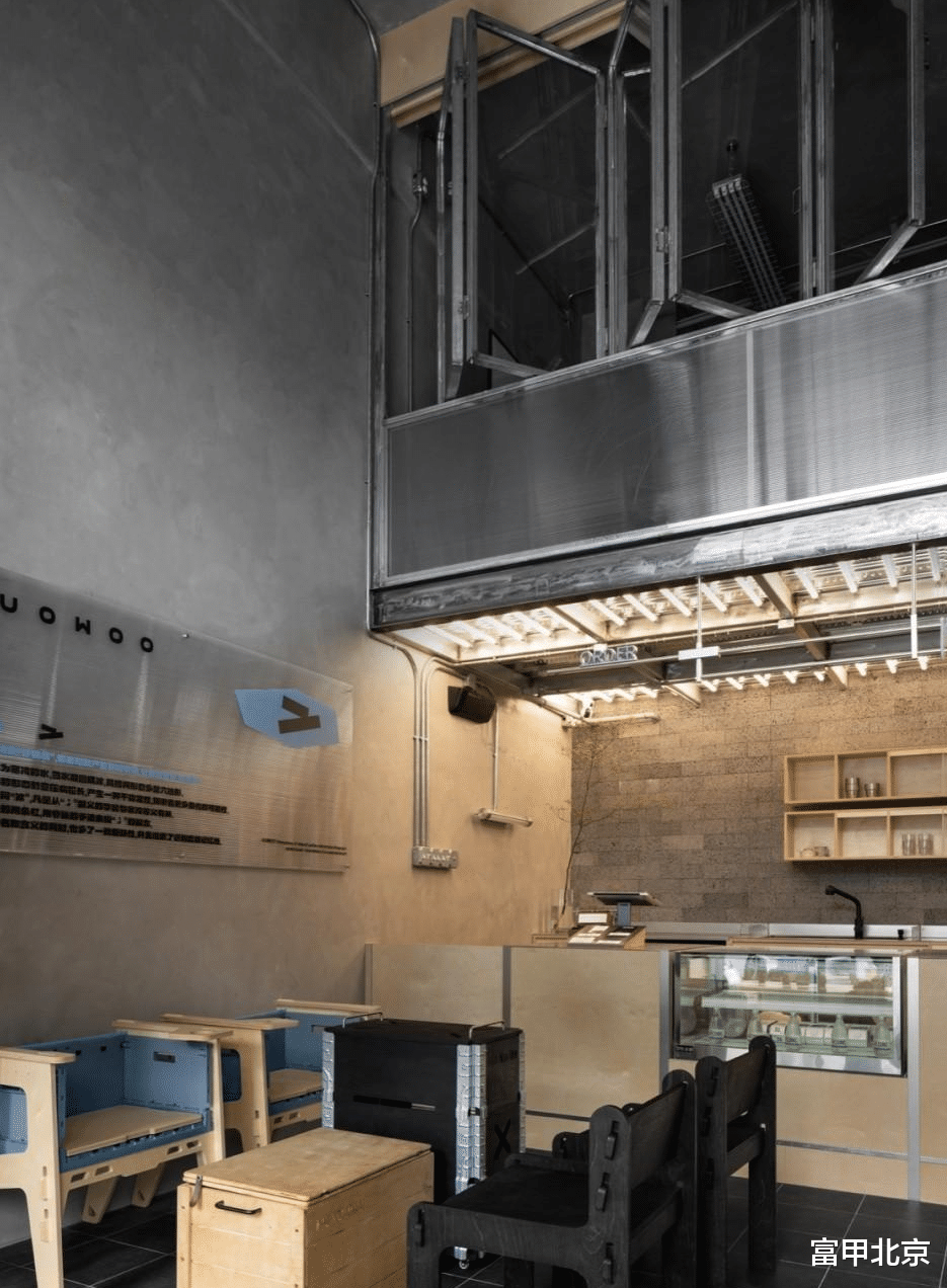

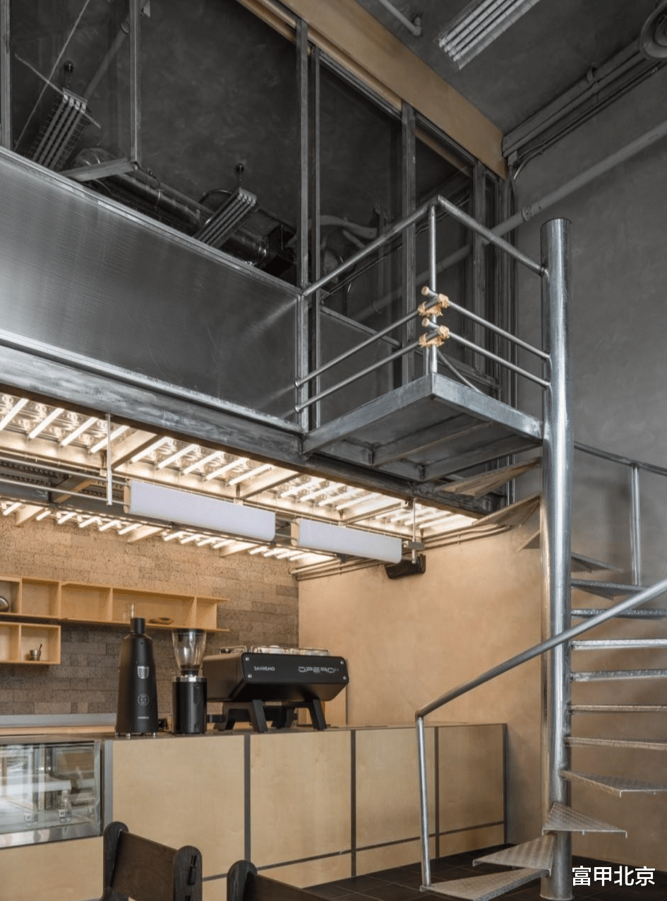
吧台设置在空间内侧,确保空间的动线流畅性,也让咖啡师与顾客之间的互动更为高效。木质元素在材料上平衡着结构带来的冰冷与力量感。
The bar is set inside the space to ensure the smoothness of the space’s movement lines and make the interaction between baristas and customers more efficient. The wooden elements balance the coolness and power brought by the structure.
▼吧台,bar counter© 内外空间摄影赵龙
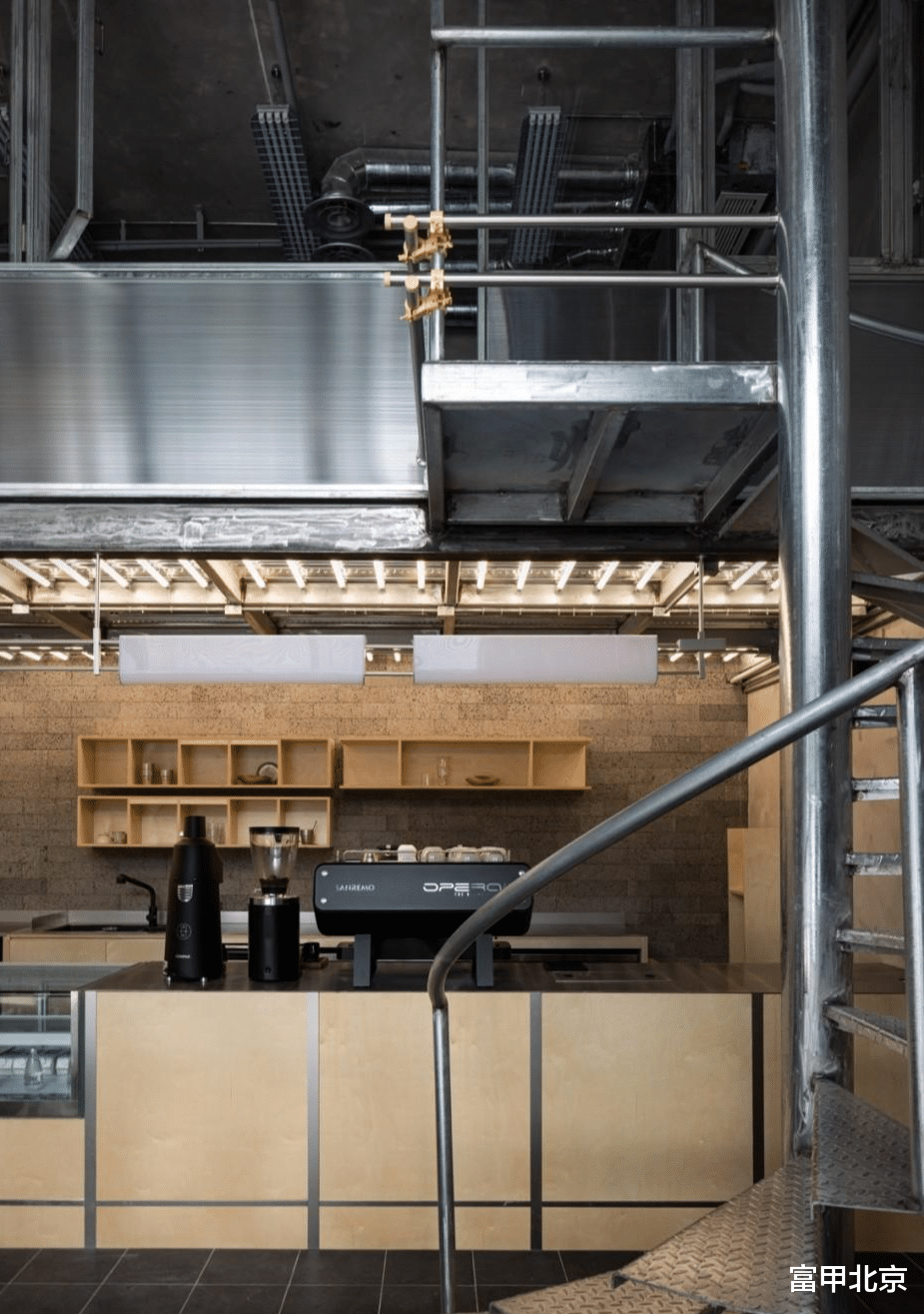
▼木质元素平衡冰冷与力量感,wooden elements balance the coolness and power© 内外空间摄影赵龙
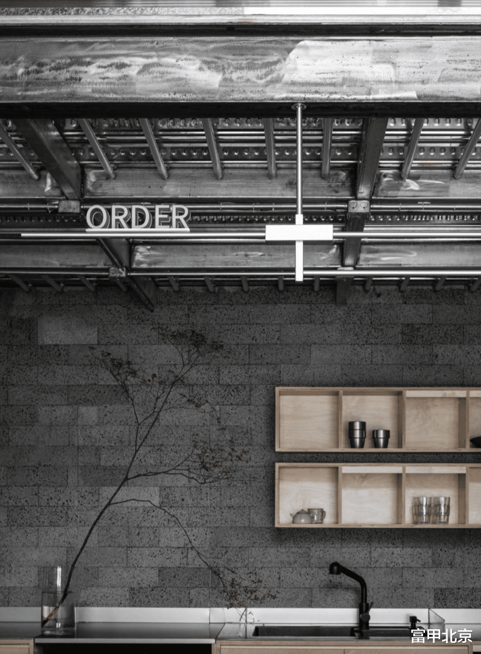
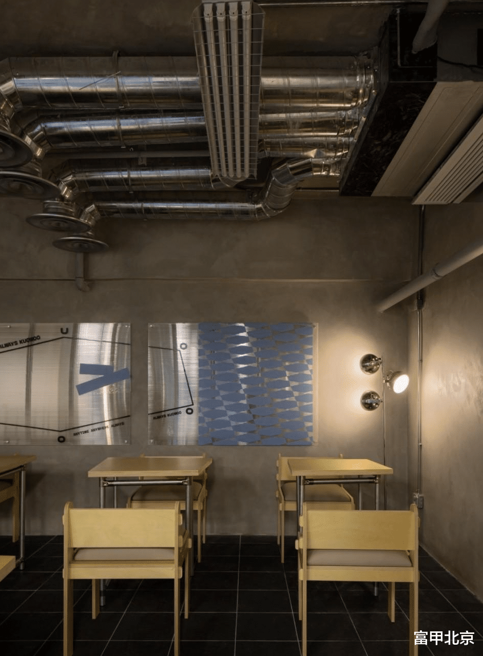
金属和水泥材质带来粗犷的工业感,与模块化家具的灵活设计相得益彰,提供了多样化的布局选择,灯具的选择上,也严格遵循主线颜色的把控。局部点缀的蓝色自然融入其中,不仅为空间带来了视觉上的亮点,更强化了品牌元素的识别度。
Metal and cement materials bring a rough industrial feel, which complements the flexible design of modular furniture and provides a variety of layout options. The selection of lamps also strictly follows the control of the main color. The local embellishment of blue is naturally integrated into it, which not only brings visual highlights to the space, but also strengthens the recognition of brand elements.
▼局部点缀的蓝色, local embellishment of blue© 内外空间摄影赵龙


楼梯置于吧台前方,同时也是空间的视觉焦点。为冰冷的空间增添了出一些层次感。台阶和扶手的细节处理,延续了空间的主线颜色,保持了整体设计的一致性。
The staircase is placed in front of the bar and is also the visual focus of the space. It adds a sense of hierarchy to the cold space. The detailed treatment of the steps and handrails continues the main color of the space and maintains the consistency of the overall design.
▼楼梯,staircase© 内外空间摄影赵龙
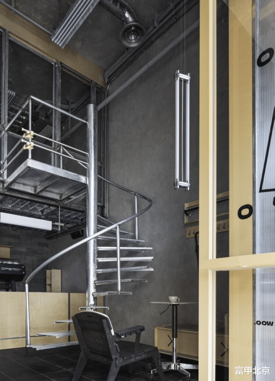

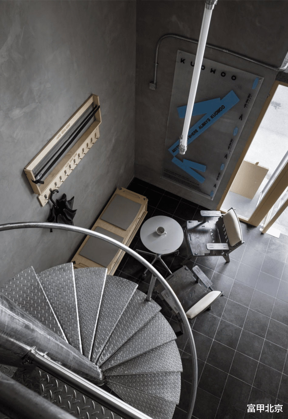
通过保留原始天花,管道外露的形式,消除空间面积受限带来的沉闷感,增加垂直空间的视觉高度,同时赋予场地一种粗犷而真实的工业美学。
By retaining the original ceiling and exposing the pipes, the dull feeling caused by the limited space area is eliminated, the visual height of the vertical space is increased, and at the same time, a rough and authentic industrial aesthetic is given to the site.
▼管道外露的天花, ceiling with exposed pipes© 内外空间摄影赵龙

沿着楼梯上去,呈现出一个功能性更加复合的空间。承载着咖啡品鉴会以及各种活动。灵活的家具布置,使得二楼能够根据不同活动需求进行快速调整。搭配灯光发挥空间的特点,不仅促进了熟悉人群之间的互动,还为陌生群体间创造了新的连接机会,成为激发对话和联系的场所。
Going up the stairs, you will find a more functional space. It hosts coffee tastings and various activities. The flexible furniture arrangement allows the second floor to be quickly adjusted according to the needs of different activities. The lighting is combined to give full play to the characteristics of the space, which not only promotes interaction between familiar people, but also creates new opportunities for connection between unfamiliar groups, becoming a place to stimulate dialogue and connection.
▼二层空间概览, mezzanine floor overview© 内外空间摄影赵龙
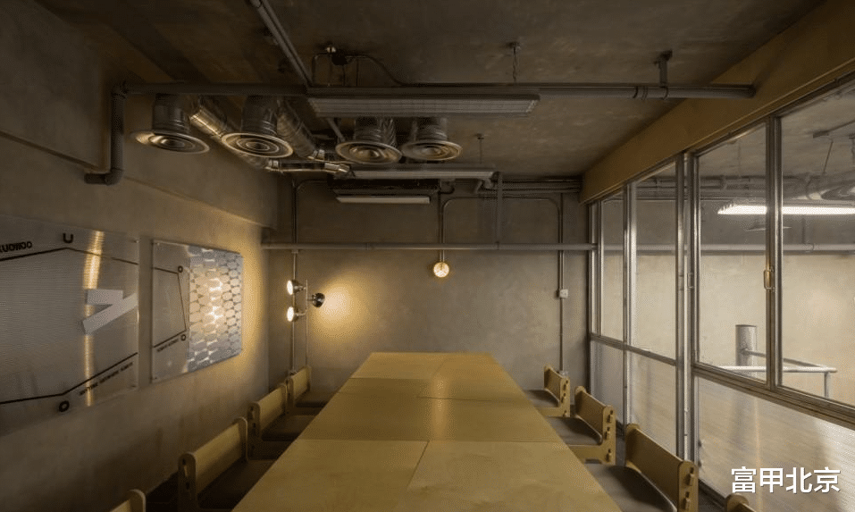
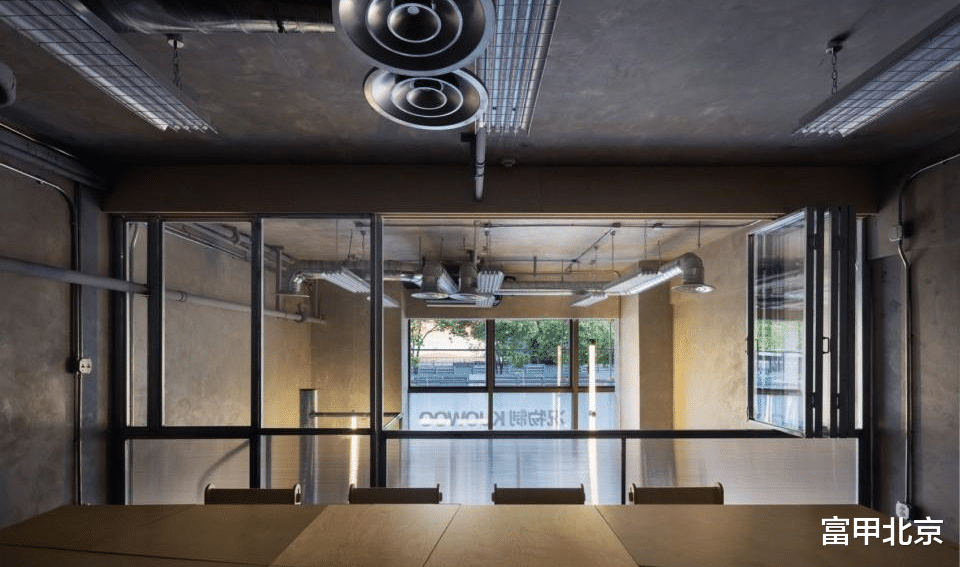
▼二楼灵活的家具布置, flexible furniture arrangement on mezzanine© 内外空间摄影赵龙
脚手架结构的侧招牌位于店铺外墙一侧,保留了原始的粗犷质感,搭配简洁明了的字体和标识,让人一眼便能识别出况物制的品牌形象。夜晚时分,柔和的灯光透过金属结构的缝隙散发出来,为整个店铺营造出温暖而吸引人的氛围。灯光与金属的互动,增强视觉效果,同时突显店铺的个性。
The scaffolding structure of the side sign is located on the side of the store’s exterior wall, retaining the original rough texture, with simple and clear fonts and logos, allowing people to recognize the brand image of Kuangwuzhi at a glance. At night, soft light emanates through the gaps in the metal structure, creating a warm and attractive atmosphere for the entire store. The interaction between light and metal enhances the visual effect and highlights the personality of the store.
▼脚手架结构招牌, scaffolding structure of the logo© 内外空间摄影赵龙


空间在现代主义里面探索手作感,与品牌的理念和行业特征相互契合,人文关怀的情感连接,给品牌价值观带来能量,保持轻松自在的状态,与焦躁的工业文明安然相处。
The space explores the sense of hand-work in modernism, fits with the concept of the brand and the characteristics of the industry, and the emotional connection of humanistic care brings energy to the brand values, maintains a relaxed state, and gets along with the anxious industrial civilization.
▼脚手架结构招牌, scaffolding structure of the logo© 内外空间摄影赵龙
▼轴测,axon© 知白设计

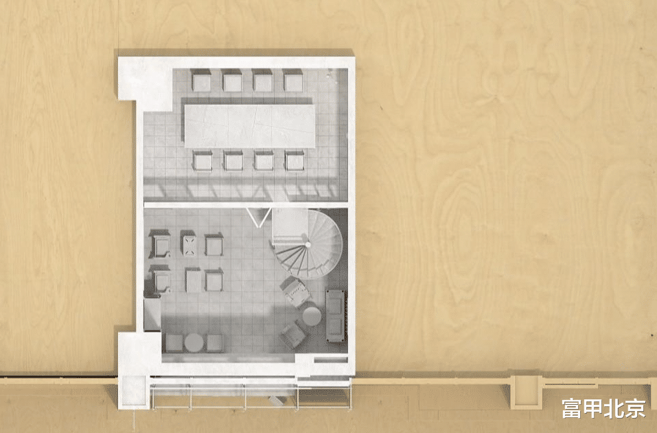
▼一层平面图,first floor plan© 知白设计
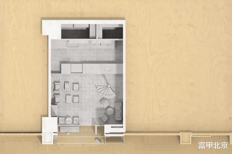
▼二层平面图,second floor plan© 知白设计
